Bar Production.

Before I actually come to make the bar, I will need to consider materials, weight and size because this bar needs to be light enough to be transported and carried up to the top of the Victoria building.

Back Panels

I started off by building two back panels and one size panel made up of Slate batons and 4mm plywood. Each panel is 1200mm x 2100mm.

On the face of each panel 150mm from the top is a 50mm bull nose baton. This is fixed there because it will support the roof that will be created.

Counter

The process of building the bar started with cutting the top to size which is 2400mmx 400mm using 18mm ply also cutting two sides 982mm x 400mm which where all screwed together. The frame was then created for the front and to support the counter using slate batons. The Slate batons are really good for keeping the bar light but sturdy.

Again like the size and the back panels 4mm ply was used to keep the weight down also completing the construction of the bar.

All the ply wood was glued and pinned to ensure stability remains throughout.]

Canopy

For the Canopy I used 18mm ply wood to make the box frame to the the relevant size of the Counter with a slate baton frame in size to carry the 4mm ply wood on the underside edge set in 50mm on the external frame.

Once all the pieces where constructed I then applied dulux weather shield stainer for effect on the areas shown using a technique sanding and re-coating 6 times to build up the colour whilst showing the grain of the wood.

Please note: I do not recommend this particular stain as it took 16 hours between each coat to dry!!!!!!

Like any project in graphic design its always important for me to test my work to ensure everything works so I decided to build up the bar temporarily using nuts, bolts and screws to ensure it all fits together, also I could then start to size my graphics up accurately.

Once everything was double checked and fit together smoothly the bar was then taken apart into its individual components for decoration and final finishing.

I decided I was going to wallpaper the back and side wall with a brick texture to give a wall effect rather than using actual bricks for obvious reasons. A problem I came across was matching up the wall paper on each panel so I decided to re attach the back two panels and wallpaper them together and simply just slice the wallpaper down the middle so the pattern matches up. The side panel proved a massive error in my design as I had to do it separate and the brick joints don’t match.

Originally for the counter I wanted to use pallet wood or rough sawn timber in a vertical pattern for effect but I did not consider the weight so I had to search for an alternative wallpaper texture. The above picture was my first choice but after testing against the bar I wanted to do it horizontal because it wouldn’t make it look as small so I decided to have some wallpaper made.

I contacted Canvas art rocks and decided to have the dark wood texture mural cut to the size of the bar. The horizontal 3d effect makes the bar look wider than vertical style paper.

After reviewing and looking at the bar itself the canopy blocked the natural light to the back walls so I decided I need some artificial lighting to illuminate the back wall where the branding will be.

I decided to contact a local electrician (my dad) to advise and install low voltage 12lv lighting into the canopy to illuminate the back wall.

Once the bar was complete I put it all together again for graphics application and light testing and chrome bar fitment. ie chrome pole, optics and simulated beer pumps that where simply made out of stair spindles.

DONE The Hanging Indent Bar Branding.

Back Wall Print

These are the designs created for the bar. I needed a back wall print of the bar name in my font, which needed to large and bold. The design I made uses a variation of colour to give the typeface depth. The original idea was to use the top two designs for the back wall of my bar but considering price of printing a large board came back in three figures which really wasn’t practical for me, so this had to change. Instead I used the top two designs for my coasters/business cards as they have a multi purpose- to put a drink on a surface without getting it wet but also people having a read of my typeface and have my website to hand if they chose to take it away with them. So, I chose to use the large hanging indent sign with no flourishes etc. I broke it down to the simplest components which would make it easier to print and cut out. I chose to print the pub name in (Page size…?) and cut it out by hand, and apply it to the wall by hand. This was a long process, especially the (gaps in the font..name?), to ensure all the details were preserved. So I did this with a cutting knife one by one, even though it took a while, it saved money.

This is what the back of the bar looks like with the hand cut out logo on the back. It really suits the colour and theme of the bar and is visible from a distance, which is what I wanted. It links in with the A board and overall looks consistent.

Top of Bar Print

I wanted to add another print to the bar to reiterate the name of the bar and show off the font a little more. Originally, I wanted a hanging sign. However, it wasn’t practical because the board used for the bar is too flimsy to hang something from. So, instead I chose to use a vinyl cutter from the making rooms to print out my top sign, so I could do what I wanted quickly and easily. I decided to put this to the left of the bar because when I put things in the bar along with things on the inside left wall as you look at it, there’ll be a lot of things on the right hand side. It just balances the view of the elements form the bar and really works well in the final outcome. The process followed is shown below.

Branding With Hamley.

Pump Clips.

Pump clips are an obvious thing when going to a bar. It advertises the beer or ale that’s available at the bar, with a quick description of what it is. A lot of the time the look and design of the clips reflect the taste or flavour of the product. I made three to go with the three pillars to go on the beer taps. These are stationary so it didn’t matter if what they’re printed on is matte or gloss as there won’t be a glare off them.

The Brown Fox.

The name “The Brown Fox” is taken from the pangram “The quick brown fox jumped over the lazy dog” which i used heavily testing my typeface throughout my FMP. The logo itself was built by simply typing out Brown Fox adding a 25% rise then redoing the same process with the word “The” and adding two flourishes from the Hamley Ornamental pack.

The aesthetic of the logo that I simply went for, is a mid twentieth century factory made feel with a modern colour palette this is why I decided to use a hand drawn sketch to go hand in hand with this trend. The hand-drawn or hand-lettered vintage logo trend has an authentic feel to it, and a sense of exclusivity; it’s clear that this was created by an artist and not just simply punched out by a computer.

I decided to use a print texture for this particular branding because it offers a more subtle appeal and furthers the handmade feel of the design.

Kerning Pears.

Kerning is the horizontal spacing between two consecutive characters; adjusting the kerning creates the appearance of uniformity and reduces gaps of white space between certain letter combinations. The hand drawn illustration below demonstrates this as if two pears are pushed together. One of the pears has just the outside look and the other one is cut to make it clear as to what the fruit is on the front of the beer tap. It reflects the flavour and the name of the cider. I purposely kept the letter ‘p’ lower case on the word ‘pears’ so the word fits tight up against the word ‘kerning’. The colour scheme chosen fits the retro aesthetic and the colour green represents the flavour of a pear.

Cotswold.

The cotswold branding

Swash (Failed Design)

Although this design didn’t quite make it to my final production it still was thought through with a swash being a typographical flourish on a glyph, like an exaggerated serif. I decide to use all capital letters for the word ‘SWASH’ because i had more choice to add swash’s onto certain letterforms. The reason this design didn’t make it is because The swallow branding doesn’t really fit with swash brand so i had to leave it out.

Bottles.
Arc of Stem.

The Arc of Stem branding says authenticity and harks back to a time when things were made with care by hand, the label itself has a distressed look and is a minimalist combination of classic logo and vintage typography to showcase the Typeface . The Arc of Stem branding says authenticity and harks back to a time when things were made with care by hand.

Boondocks.

The boondocks branding is the only one not related to typography. This is because the whole logo is completely hand drawn with my typeface added to it. I wanted this to be completely mine as it is slightly more on the formal side, the old-fashioned nature of this hand drawn design gives the logo a vintage, artisanal look which is perfect for my typeface and how it should be used. This is an approach i considered because i am trying to express dedication to my craft. I wanted to show that I’m not only a graphic designer but i was sticking to the early illustrator and fine artist in me from high school where i would just simply sit there and sketch.

Ampersand.

The ampersand Whiskey label is showcasing two things;

Firstly how the Hamley typeface can work well with other fonts such as Nautica.  Combining these two very different fonts is establishing a clear hierarchy between the two showing that they both compliment each other.

Secondly the badge that is used for the design comes with the Hamley typeface so i created an example of how this can be used.

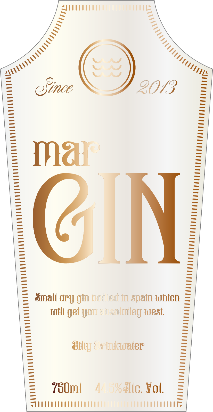
marGIN.

For the marGIN branding I’ve tried to steer away from the vintage aspect to show how the typeface could work with a clean look. The logo itself is my personal logo but I’ve decided to incorporate for the purpose of this branding because it represents waves and the sea and the word ‘Mar’ is actually Spanish for ‘Sea’.

Deckled Edge (Failed Design).

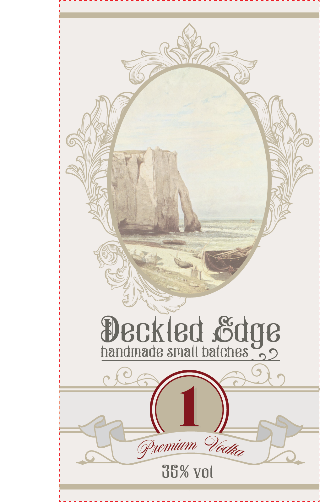
The Deckled Edge branding was originally a personal favourite of mine because I’m biased to vintage and retro design and ive used all the acanthus leaves out of the hamley pack but after asking my peers what they thought it didn’t go down to well so the project was scrapped.

DONE The Hanging Indent Bar Branding 2.

Coasters

The coasters I made are from the original logo that I was going to use for the branding of the bar. I paired it with a business card giving a two in one feel. Within the flourished and ornaments, I added my email, website, phone number, along with the logo and what the whole exhibition is. These turned out well and have been displayed on the bar itself. The design of the coasters works really well.

Menu.

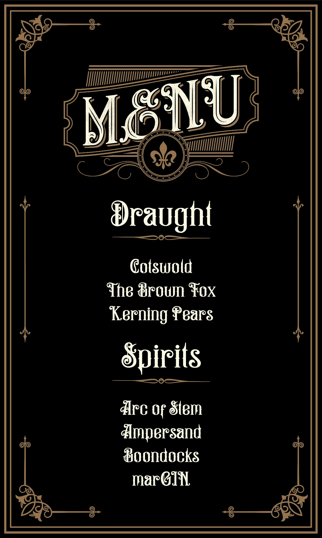
I added a menu to the bar, it shows flourishes and the typeface. It lists the beer brands I made with the typeface and the spirit labels too. This is also incase people can’t see the the spirit labels behind the bar.

Description.

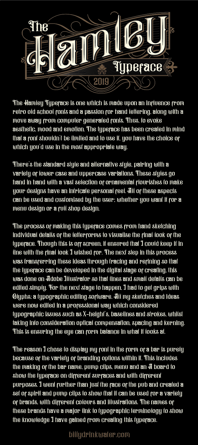
When making my bar, some people questioned what it was about. Even though it was, to myself and others on the course what it was, it wasn’t going to be obvious as to what the bar was about. Because I wouldn’t be at the exhibition for all of the opening hours there was so I needed something think a description document to help them out if they didn’t understand. The description print out outlines what the project is about, a summary of a process that is used to make a typeface, what the typeface is influences by and more, but condensed enough that people weren’t bored.

DONE The Hamley Typeface .

For the display of my font, I needed to make a display document for what’s included in the font pack if to be purchased but also view before the purchase. Below is what could be used as a preview button online, but also as the headers to a lot of the things produced for exhibition including my A board. It’s just like a ready made header for myself which really helped in the production and design process. The look of it has worked out the way I wanted and the depth of the black against the deep brown allows for the detail in the typeface to stand out more than expected by myself.

The Booklet.

This is the booklet which I have produced outlines everything you would get if you get the typeface. This includes the typeface itself in an upper and lowercase variation, numbers, and punctuation. It leads onto all the ornaments that you get with the typeface. On my cover page I’ve shown a few ways the ornaments can be paired with the typeface, without adding too much to the cover.

The last detail added to the booklets is my personal website where people can find who I am, how to contact me and so on, which is much more efficient. Without writing my name and all of my details at the bottom, they can simply visit my website instead.

A Boards.

Here you can see these booklet pages in action. I created, for my exhibition, an A board. These are outside of bars to advertise an offer, who they are and other things. So, carrying on this idea, I’m using an A board to advertise what my bar is about – my typeface. I chose to display the typeface with everything previously made above. This is paired with a dark brown wooden board, this links really nicely back to my bar design and gives people an introduction to what I have made for my final major project.

DONE Pub Names.

Choosing a name for my bar will be the best opportunity to connect with other designers, but i need to remember I’m not selling a bar i’m showing how my typeface can be applied on various applications and used for branding. As my target audience is other designers I’ve decided to use witty typographic terminology to create a pub/bar name. This shows off my typographic knowledge that I have gained through this project. I didn’t want to use a name that was too typographic related as people may not understand what I mean but I needed something that would sound like a real bar. Below are some ideas I’ve come up with so far:

  • Swash and tittle
  • Arc of stem
  • The Kerning Pairs
  • The Hanging indent
  • The Open Type
  • Deckled edge
  • Cotswold
  • The Ampersand
  • Tabular figures
  • Strike-through

The whole aesthetic is important when displaying the font so I decided to test the names using The Hamley typeface to get a feel for how they would look. Some worked better than others in relation to the design and look. The one that worked the best was the Hanging Indent and The Kerning Pairs. Upon reflection, the The Hanging Indent is the more successful name because I can literally make it do what it says in the logo, whereas the Kerning Pairs could be used of a pear flavoured cider with a beer clip.
Reasons Behind the name.

To extend this, disregarding the design part, the reason why I choose the hanging indent as it sounds genuinely like a pub that you would find in a day to day situation. It can be used as a bar name on a logo, a back wall display, a menu and more.

Further extended research.

Amsterdam 2nd to 5th May

With the James Lewis trip to Amsterdam I managed to get to a number of museums and exhibitions that where on in including the Banksy exhibition at Moco Museum. Although this is irrelevant to my Typography is was good inspiration for exhibition layout.

One that really stood out to me and has inspire my bar was Warhols 3d room illusion which was life size. This gave me insight into making a life size bar.

Although it a generic photo I still love how Banksy creates a metaphor that can resonate with almost anyone who is struggling or has struggled. When everything appears to be black and white, there is always a glimmer of hope pushing you through.

Exhibition.

The exhibition is my final shot at university and the start of releasing my Typeface, this means thinking through every aspect, from what my exhibition stand might look like, to how to set it up, through to how i will sell to customers.

For the exhibition i will be out sourcing and having a pub/bar made up so i can concentrate on showing of the typeface and if i was to build it it would be too time consuming. The reasons for doing this design is there are that many aspects of a pub/bar that can display various formats of my typeface to show how it can be applied on different objects.

My Deliverables for the Pub Design.

  • Main sign (hand painted)
  • A Board displaying Typeface
  • Back wall print
  • Bar print
  • Beer mats
  • Menu (selling Typeface)
  • Beer tap (custom brand)
  • Spirit labels (custom brand)
  • Pub sign
  • Flyers displaying typeface
  • Drip matts (Custom)

Finishing techniques

  • Hand Painted
  • Spray
  • Print
  • Material

Selling my Font and licensing.

Investing in myself

As a designer, I have to continue learning and being up to date with design trends, this means attending workshops, reading up on designers and improving my skills on the latest software.

As software and computers goes, I have to have the best or the latest I’m stubborn like that. As typography goes the industry standard is Fontographer by FontLab Studio which I would normally go for BUT! before purchasing I did my research and came across Glyphs. The reason for choosing glyphs to build my typeface on (although it is more expensive) is because it is new and more modernised which isn’t always the best but, because it is very similar to illustrator with the pen tool/anchors and you can set up keyboard shortcuts to however you want etc. This made Re-drawing the letterforms less time consuming.

To be successful, I believe you need to be a life learner. This means I need to invest in personal growth by regularly attending conferences, listening to podcasts or even reading up on design trends. I do this because without realising it can add immense value to my brand/freelance and network. I also have a habit of emailing designers personally with questions on how did you do this? Why did you do this? Etc. Pushing these boundaries has led me to be invited to a workshop in Amsterdam with James Lewis where I will receive a final critique on my typeface, and he will be teaching me techniques to further my skills as a typographer.

Marketing the Typeface

The saying ‘Don’t judge a book by its cover’ well in this case most people will judge a font by its cover. The starting point before I come to sell the typeface is to show the audience how good my font can look (don’t just use a boring background) by creating a graphic that explores the inspiration behind the font or utilize it in a way I expect the buyers will use it. Things I will need to consider;

  • Colour
  • Size
  • Angle
  • Name of Typeface (Sticking with Hamley as it uses my favourite characters)
  • Will it be mocked up on shop front or barbers etc?

Personally (not to blow my own trumpet) I think this font stands out already because it is versatile, flexible and can be adapted in different ways with stylistic alternates and small caps which already increases the usefulness as it can be used as a display and type font. The font needs to include ‘bonus’ packs with Ornaments and acanthus leaves on a VARIETY OF TYPE FILES! This is to ensure the largest pool of consumers will be able to use my font design. Files to consider;

  • EPS
  • AI
  • TTF
  • OTF

Other things to consider when selling a font is how this font will be organised into folders when it is downloaded as a ‘pack’.

  • Folder structure
  • Preview imagery
  • Description and pricing
  • Font files
  • Bonus files
  • Type specimen
  • Keywords for search engine
  • Profile page
  • Contract

As my Instagram is growing rapidly and with it being linked to my website, I’m increasing traffic with thousands of views daily. By posting brands or images using my personal font, (and the power of hashtags!) I can advertise it with descriptive paragraph on the typeface and give instructions to my website link in my bio I will generate views to my Instagram and website.

Selling on my own pros:

  • I will get 100% of font sales every time.
  • Total control of freelance business from design, web elements, marketing strategies and pricing.
  • I have direct access to all my customers so I can build long term relationships.
  • Again, I have full control of everything.

Selling on my own cons:

  • Creating a store front, handling sales and providing customer service/support.
  • Marketing and designing at the same time could be more hassle than it’s worth.
  • Marketing on other platforms from Instagram may be costly!

Back-up plan to Marketing.

The reason I’ve decided to sell it on my own is because when it comes to licensing commissions, 50%-70% rate is the average among font retailers like My Fonts and Font Spring already I’m losing half or even more of the money. Also, once I join certain font foundries, I’m limited where I can sell my font depending on the contract which agreed upon.

Font Foundry Pros;

  • Fonts under foundries are sold through multiple channels, which means my font would have better exposure beyond the foundry’s main site or store.
  • Foundries protect their designers and the designer’s fonts against piracy (Massive Pro).
  • I wont need to market my own font.
  • Foundries will handle all the customer support for me
  • Font resellers prefer foundries
  • No administration or business knowledge needed.

Font Foundry Cons;

  • Smaller income if fonts are sold by resellers.
  • No control how or where my work is sold.
  • Stuck in a contract.

Using the exhibition to my full advantage

THE most important part of my FMP process is not only about making an exclusive font – it’s also about presenting it attractively. I’m going to treat the exhibition as my only chance to reveal the typeface, so I need to be careful about every little detail. Essentially, presentation in the exhibition should demonstrate the practical potential of my font and the way specific industries can use it to advertise their services.

Ideas for exhibition;

  • Use a shop front mock up (a decent one not a free one) so that people can see the Typography in context.
  • Display full typography on three big board’s considering colours etc.
  • Display a sentence that uses most letters (the quick brown fox jumped over the lazy dog)
  • Vintage colour palette is a must! OBV!

Licensing

Legally, Fonts are treated as software. If I don’t sell my font and just give it away (to a friend for example) they will still need a licence to use it. if I was to sell a multi user licence to a corporate industry to be used on say more than five CPU’s or more than one device I would need to write up a full agreement of how it can be used.

James Lewis Workshop Amsterdam.

Why should i Network?

The graphic design field is very competitive. In order to succeed, I need to set myself apart from other designers. This is difficult when I am still studying so I’ve tried to reach out as much as possible when I can. Because I also freelance, I need a way to build a client base, give myself an edge by being social the more people i know, the better. Networking is the key to finding new projects and clients, learning tips from other designers, and promoting myself and my business.

Branding myself.

I like to think of myself as a brand. Publicise myself by talking to as many as possible and mentioning my career in graphic design. I like to think how I would like to be viewed and give off that vibe. Although I am very loud and can be intimidating to others, when it comes to networking I will still keep my personality but tone it down and act professionally and create a positive image for myself.

“Look for your design heroes on Twitter and strike up a conversation. Follow those who inspire you and periodically ask for opinions or advice on your own work. Pointers and tips from those in the know are invaluable for pushing you in the direction of those who can help make your work reach a wider audience.” https://www.creativebloq.com/career/network-with-designers-712372

https://www.instagram.com/jamesllewis/
https://www.jamesllewis.com


—Notice how quickly James has increased in followers over a period of two months.

I came across James Lewis on after having a massive following on instagram, his work is shared all over and as you can see he has over quarter of a million followers. He is a passionate artist who enjoys sharing his creative process by teaching workshops globally, public speaking, and creating viral video content. He combines his love for letterforms with his graphic design skillset to craft bespoke lettering which is famous for standing out. James’s work has been featured by a number of publications including Creative Review, The Guardian, Creative Bloq, Expressive type (book), Good type (book) and Behance. Along side that he has work along side some big brands such as BBC, WIX, Red Bull and Samsung.

For a while now I’ve been curious on how he drops the shadow on his letterforms, what technique he uses to create this effect as i would like to implement this into my lettering work. I’m curious to see his creative process as his videos don’t justify enough for me as I just want to ask questions direct. So, i decided to contact James via email just out of curiosity if there is any possible way he could help me after bouncing emails back and forth he invited me to his workshop in Amsterdam…

On the day of arriving at the workshop, after being introduced to everyone, we were presented with a handbook which broke down what we were doing in the day, a set of tools including pens, brushes, rulers, paper stock, transfer paper and so on.

Firstly we was going through the basics of letterforms and he taught us about the term ‘optical compensation’ this is something id heard before but not in great detail and it would really effect my letterforms.

“The human mind needs to decide whether something looks optically correct or not, because we can see and understand a context when a computer can’t. Understanding these subtle differences and knowing how to adjust them is what makes a good designer even better — few will notice if it has been considered, but many will notice if it hasn’t.”

Basically it was very important as it was in the early stages of the workshop process. As we moved onto discussing this subject further, we spoke about how our brains perceive the size of objects specifically text. If we think about this in terms of circles and squares, a 100cm square has a larger surface area than a 100cm circle, so the circle must be larger to compensate.

Where overshoots on curved letters drop or rise above the cap-height, baseline, etc. If you write a line of text in Garamond and draw a line on the baseline and x-height of the text, you would see the curved shapes overhanging these lines. If these overshoots didn’t exist, the individual characters would feel too small next to their siblings.

Optical adjustments also apply in colour but are more subtle. again, it is about the weight of the object, and how much of the colour appears. If you have a logo (for example a square) next to a thin typeface and they are both red. The type will look a lighter shade of red so you have to compensate and make it darker.

after this discussion we started on the handbook of scaling letterforms up by 4x just to get a feel for when we paint and to test our ability. Personally i found this easy but its all part of the process.

The second task was creating bevel and shading them with a light source from the top left hand corner. Again, this was easy but i think it was just a feel for him to gather everyones knowledge on shading with a certain light source.


after the bevels we moved on to talk about the way to add depth and dimension to your letters so that they appear to have 3D characteristics.  It was very basic with the whole vanishing point but what i found interesting and very useful is how the shadow will react and appear on the side of a letter (it was hard to grasp) but i think practicing these basic principles until they make sense will help me create more complicated perspective pieces in the future, and take my lettering to a whole new level!

THE TECHNIQUE!!!

This technique looks simple but infact its a lot harder than it looks, i managed to video James doing an example while talking us through the process before attempting ourselves. Unfortunately it won’t upload to wordpress so i will leave all videos on the USB stick.

Watch James Lewis Video 001

Watch James Lewis Video 002

firstly when drawing on the grid we had to re-create this ‘H’ letterform using the technique. again i found this easy because i had something to relate too. notice how the shadow is formed from the third letter ‘H’ this is something ive been trying to do for a while.

Next attempt i decided to challenge myself by drawing my own letterform of the letter ‘H” from my custom typeface Hamley. this wasn’t so easy because of the flourishes, but in the end i gathered the process and it went down very well even all over Instagram.

James seemed very impressed with my sketch along with thousands of other people. he tagged me in a video and my instagram took off!!

Painting.

When it comes to painting i haven’t got the steadiest of hand, its something i need to practice and i will consistently keep practicing till Im perfect. But for now James taught me a technique that is similar to using a mahl-stick if you look in his videos he’s uses a mahl stick regularly to help steady his hand. The 3rd video shows the technique on how to keep a steady hand.

Watch James Lewis Video 003

The whole workshop was an experience it has give me an insight into hand lettering and helped me understand more in depth how to create the shadow behind and on the letter itself. In the future (also exhibition) i will be using these techniques to show off my typeface and how it can be adapted off screen.