Naming my Typeface has proven to be difficult there are some thing that need to be considered based on utility, marketability, and aesthetics.
Utility
An important factor when it comes to naming my typeface is that the name embodies the typeface. Although the name does not have to generally representative the style of the typeface, the name nevertheless imprints onto the typeface, and so a typeface becomes both the design and the name. As such, i should always think of what a name denotes or connotes. What things does the name conjure up, and does it reflect well onto my typeface?
An idea i had to give users quick access to my typeface is to name the typeface something that starts with an A or possibly even a number, so that it will appear at the top of the user’s font list. Another idea that could work is to name the typeface something starting with a rare letter, such as Q. The fewer fonts somebody has installed, the least likely it is that they have fonts starting with Q. If the user were to type Q in the font menu, they would immediately see my typeface.
Marketability
Memorability — A name should be memorable. I think of names like Helvetica, Univers, Arial, and Futura. The names are clear and relatively short, which makes them easy to remember and easy to market.
Impact — Names should make impact. Shorter names tend to make more impact (think of DIN – one i always remember), but a few more letters may be needed for a name that distinguished itself from others. But also that a name like Futura is quite a bit stronger in terms of linguistic impact, visual impact, and connotations than Gill sans.
Aesthetics
I find it important to include letters in the name which i definitely want to show as they reflect positively onto my typeface. For example, if the typeface has a rather unusual ‘a’, it is probably good to make sure that letter is in the name. This is not only smart from a marketing perspective, but i can control the impression the user gets from my typeface. But also, i just want to show some beautiful letters; letters like ‘a’, ‘e’, ‘g’, ‘n’, ‘s’, and ‘y’ could be common for lowercase letters. Of course i have not forgot the first letter is capitalised!
To sum up the name has to be unique, relatively short, carry the proper connotations, and feature as many unique or beautiful letters as possible in a name of a given length.
All names will be checked on the link above for copyright purposes.
Albert
Antel
Aamley
Bernard
Hunter
Hardy
Harvest
Hudson
The final name I went with was a combination of previous ideas Hamley was chosen as a result because it displays some of my favourite characters and its got a vintage yet modern feel to the name.
The reason I’ve decided to use Glyphs is because it offers up a comprehensive workflow with a vast array of tools and the ability to build a full family of weights and styles within one source file. It’s built on familiar UI principles with many of the shortcuts for the tools being the same shortcuts you would use in Adobe CC which is way better for me. Glyphs manages to make complex tasks and tools feel intuitive from the outset. You can also take control and define your own preferences by way of using custom parameters.
The pros and cons of using Glyphs.
Pros:
Easy to learn, easy to use (easier for me because of time constraints)
Combined text and drawing views, in which layers can be automatically generated
Basic OpenType features that can be previewed
Scriptable and expandable
Comes in two versions
Pretty much same shortcuts as Adobe CC
Cons:
Mac only (not really a con as i only use Macs)
Well there isn’t any cons hence why i decided to use this software!!!
Even though i have decided to use Glyphs (after hours of research on the best platforms) as my choice of font builder for this project, i will however continue to learn on other platforms when i have more time after university.
Lets get started…
The first step to created each letter head was setting the parameters to the same specifications i first drew them in illustrator. Once i had them in place i could then begin the tracing stage of each individual letter using the pen tool on Glyphs which is very similar to Adobe Illustrator.
Capital Letters
Lowercase Letters.
Letter Spacing. (Tracking)
First off all i had to get my head around Spacing/Tracking and Kerning!
So letter spacing refers to the amount of space between a group of letters to affect density in a line or block of text. Letter spacing can be confused with kerning. Letter spacing refers to the overall spacing of a word or block of text affecting its overall density and texture. Kerning is a term applied specifically to the spacing adjustment of two particular characters to correct for visually uneven spacing. Kerning adjusts the letters closer together (negative spacing), tracking adjusts the letters further apart (positive spacing). The letters AV, for example, have to overlap in any usual typeface, otherwise at least one them ends up looking lost. The kerning is tightened to snug them up to one another.
Moving on to just the spacing/tracking i had to work out how to change the spacing while in a preview mode this is where you can type text, in order to edit and test your font. So to access this i had to go to view > open tab (Cmd-T). The selected glyphs are then opened in the edit view, and the text tool (T) is now active.
I can now type any text i want, and edit any of the typed glyphs. This is one of the key features of the software that i prefer over fontographer.
spacing editing
See Spacing with a little kerning video on USB
The first step I’ve taken is sorting out the spacing with the two letters ‘n’ and ‘o’ ive used these two letters as a starting point because they have the structural characteristics provide a useful basis for making many of the other letters in the font.
Although the ‘o’ is especially useful for working out the basic spacing, it’s not going to help me design other characters — not necessarily even the ‘b’ or ‘d’.
The letter ‘n’ is very useful because it helps making the ‘m’, ‘h’, and ‘u’. The other factor that i need to weigh when choosing letters for the foundation is how frequently the letter is used. A letter that’s used a lot will help me make test words so i should consider moving onto the vowels next or further more using ‘hanbergfontsive’ again as i contains the most frequent letters used.
From this process so far i’ve learnt that it is impossible to create a coherent set of characters without studying them in combination. And FRUSTRATINGLY, it seems that there is no absolute formula to fit all the characters perfectly: correct spacing is the result of a combination of reasonable judgement of the eye or trail and error, and the individual designs of each letter have a massive impact on this.
Again like i did on illustrator ive decided to use a big sentence that contains most of these letters as a better starting point. Below you can see some of the letters are still off…
Now that the spacing is even it still doesn’t look quite right.. this is ok because certain letter such as the ‘o’ and ‘v’, ‘o’ and ‘x’ will be altered in the kerning section for individual letter combinations.
So through testing and writing different words ive come across and error in my design. The lowercase letter ‘k’ isn’t sitting right which will mean the uppercase won’t either. The leg comes out to far on the bottom so this will mean back to the drawing board (illustrator) for these two letters…
Letter Changes
After looking over the letters ive decided to change some of the capital letters as i feel they look to thin on some areas. The letters ‘k’ ‘K’ an ‘R’ are easy enough to change in Glyphs.
New lowercase kNew uppercase KNew uppercase R
The letter ‘B’ needed to be updated because as the process went on of developing the letters the style changed slightly and because I’m bit of a perfectionist i couldn’t let this to letter go.
Kerning.
Manipulating the whitespace enclosed inside a pair of glyphs is called kerning. Kerning is something you do very late in the Typeface making process. Ive tried to get as far as possible with properly spacing my letters. But ive noticed that, no matter how well i do it, some letter combinations never really work out properly. This is the part where i have to kern individual letter combinations to correct the spacing below is an example of the kerning.
Notice in the first picture how the letter T seems separated from the other two letters. this is why some letter i have to make specific adjustments and combinations so that when the typeface is used it will look seemless.
The kerning process was difficult because i couldn’t think of anything to write so i just kept writing random sentences and adding capital letters through trail and error until everything looked right.
After not finding a fault i thought of an idea for testing the typeface in action. Its to export the type face and change the font of part of my dissertation to see how it would work with big blocks of type (also to see if i can see any missed spacing/Kerning).
Video Example of trail and error kerning
See kerning example Videos on USB
The accented characters was massive pain to keep consistent because i had the automatic setting on that puts the accents in the same place this proved difficult for me.
After managing to turn of the meeting i had to set all accents manually which was time consuming but worked out perfect
After presenting my typeface i received some feed back on my numbers as they weren’t quite sitting right within the typeface. Another addition to this is that i had only made a small case number set as i though it would look better but when it came to testing they didn’t look right.
Old NumbersNew Numbers
See New numbers example video on USB
With the first set of numbers i think i may have rushed them a little bit when i look back the number 2 just irritates me it doesn’t stand as strong to the other numbers. It looks off balance.
The new number 2 is something I’m really proud (i realised im not the best at numbers and its something i need to work on in the future) of as i concentrated so much on the typography at first that i just cruised through the second set i took a step back and looked how strong my letterforms are of the Hamley typeface and create these numbers to coincide with.
The Northwest sign above was designed straight after i finished the capital letters, the reason i made this sign with so much detail is to show my peers in my class the idea behind what i want to create/ the direction i wanted to go down. After receiving positive feedback i the pursued my lowercase version.
So to analyse the name Jenna ive found the letter ‘n’ doesn’t quite sit right its missing a top arm on th left side of the ‘n’ this will also apply to other letter such as m, p and r.
Testing the lower case I came across a problem with the letter “t” the cross bar was to small it looked out of place whereas in the line up of letters it didn’t.
From the ‘Natasha’ word I wasn’t happy with the cross bar on the ‘t’ it didn’t quite sit right so from trail and error I’ve corrected the bar to make it on line with the lower case letters… see below ‘Hamburgefontsiv’.
Letters and details test.
Going back to my Brief I stated that to test the font using (Hamburgefontsiv) as it uses many of the most common occurring lower case letters in the alphabet. From this test I can now progress to the next stage.
A pangram, or holoalphabetic sentence, is a sentence that contains every letter of the alphabet at least once. The most famous pangram is probably the thirty-five-letter-long “The quick brown fox jumps over the lazy dog,” which has been used to test typing equipment since at least the late 1800s. “Sphinx of black quartz judge my vow” is used by Adobe InDesign to display font samples. I used the ‘s’ instead of the ‘z’ because it hasn’t been used in any of the sentences… it is on purpose its no a spelling mistake.
Pangrams are an important tool for testing typing equipment and compactly showing off every letter of a typeface; trying to pack every letter into as short a sentence as possible is also a sort of sport among linguists and puzzle-solvers.
From this test I can see IT WORKS! apart from the letter ‘f’ doesn’t quite sit right its unsettling to look at on both sentences this is why testing my letters before designing them in fontographer is so important. So this amendment is my next job before moving on to the numbers.
The new ‘f’ fits the rules of the type a lot more with the top swirl and the sharp edge. i tried to be to experimental with the first ‘f’ but it didn’t work.
Amended sentence with new F
From testing the letterforms I have learnt that the letters on there own may look right but used in a sentence they can throw one another off. Testing the letters against one another has been THEE most important part of my process if i had not repeated the testing process the font itself as an OTF would not have worked at all.
Display branding test
Below are three examples of how the font can be used for displaying brands. Unexpectedly, i didn’t expect this to work out the way it did the first time however, i think this is all down to the testing in earlier stages of my font process.
Below is an example of how this font can be interactive. notice how ive taken certain elements off the letters ‘N’ and ‘A’ to suit the bands name and layout of the letters used.
Below is is an example of how a font can be used in a name situation/Branding. I have used a different colour ut keeping to the same single colour to the standard black ones above to give it a more vintage feel and used a line texture and ornaments to create the full effect. The second one i wanted to experiment with my custom acanthus leaves that will be part of the pack also i created an example Spanish coffee brand to show of the accented characters.
NOTE: the acanthus leaves on this logo are just my basic drawing lines… see Flourishes and acanthus leaves for the leaf process.
the blink 182 type was a test to see how the numbers worked alongside the letters. i much prefer a lowercase number set because its the original case form and it suits the style much better. The banner above was a test, Yes it is a massive fail but, it is also an example of how the font doesn’t work, the typeface i have created is more premium and hipster.
Testing out the numbers and punctuation i came across a problem with the equals symbol. The fact its too large for the other symbols many people wouldn’t really notice or infect care, but as a designer and someone who sometimes can be a little bit of a perfectionist its just unsatisfying to look at.
After receiving feed back from Mark on my lowercase typeface. He stated that for the @ symbol i would have to re-create a different letter a for the symbol because it wouldn’t look right so i decided to create both versions so i could compare.
After comparing them both personally i prefer my original idea (the symbol on the right) but as it is an interactive typeface i have decided to keep both @ symbols and leave it up to the user to decide.
Letter M Final design
Surprisingly the letter ‘M’ was a massive problem just looking at the first three designs it didn’t quite sit right, the first two seemed to flimsy with the centre column and spiral and all three sat too wide. After going through various designs i came up with the new concept which fits well within the guides and stands more strong with set weights.
Victorian designates an era when many designers and artisans were intensely interested in ornament. It was a time of global exploration, and when the art and design of distant cultures made headway into the mass culture of Europe, England, and the United States for the first time. ‘Victorian’ is shorthand for ornamental exploration as well. Nineteenth-century experimentation, layering, and sampling combined pen flourishes with geometric traceries, classical constructions with Middle Eastern interwoven patterns. It was all fodder for design. Vector illustrations, which spread into modern graphic design with the Mac.. Right now, designers such as me are rediscovering ornament from the past-many pasts-and relearning how to use it. I have now created ornamental leaves by drawing originals and tracing them into as digital vector, or outline, files.
In the beginning stages of development whilst creating sketches of the Typefaces, i experimented with some designs of these Acanthus leaves to go along side the Typefaces to complete the pack. Now ive created the typeface ive come back to these and vectorised and developed/improved to a higher standard.
From the initial sketches ive now traced them on my iPad and sent over to the Mac to add detail such as line weights, Depth and hatched shading using lines. The Pen Tool is one of the foundational tools of Illustrator. Illustrator has many ways to create and adjust shapes and paths, when it comes to drawing custom vectors or tracing sketches there is definitely no better tool however, i used the direct selection tool to move the points a round alongside the pucker and bloat selection to create line widths.
After the James Lewis workshop I decided to do further research into optical compensation and the term trusting your eyes.
Font design is the process of iteratively testing the individual choices that collectively add up to a complete design. I will be testing my font to see if the combination of decisions I have made:
Font to be readable
Makes the font feel right to me
Makes the font useful for the the jobs i want the font to be able to do.
As i test the design, I will have to trust my perceptions and design somewhat practically. Much of type design requires that I make letters similar and that I make sure I repeat forms.
At the beginning it is tempting to assume that if I measure the parts and the spaces between the glyphs, then surely I will get reliable results. While very useful, this approach has real limitations. I should expect to make adjustments if something looks wrong. Furthermore, I always feel confident that making changes until it “looks right” is the correct thing to do.
The reason this is true is that there are a number of natural optical illusions that all readers are subject to. These illusions must be accounted for by altering the shapes of letters until they look right.
Examples of illusions
Some illusions involve the perceived weight of lines, some involve the perceived length of lines, and others involve the eye’s perception of shapes.
Horizontal vs. vertical weight
The example on the left shows an ‘H’ which bars are precisely equal in thickness. This looks wrong. The other one on the right has a horizontal bar which has been thinned to appear equal in thickness.
Glyphs in which optical adjustments have to be made are numerous and include A, E, F, L, H, f, t, and z.
Diagonal thickness
Similarly, if you have bars of the same width and one of them is set at a diagonal, the diagonal bar will seem slightly heavier than the vertical bar and slightly thinner than the horizontal. If you want it look right, you will have to adjust it to be lighter like the horizontal example, but just a little less.
Glyphs in which this human perception may be relevant are quite numerous but include k, K, N, Q, R, v, V, w, W, x, X, y, Y, 7, 2, &, ł, Ł, ø, Ø, √, ∕, ‹, ›, «, », ½, ⅓, ¼, ≤, ≥, and ×.
Length and perceived diagonal angle
Longer shapes need to slant less than short shapes in order to give the appearance of same slant.
The image below has diagonal lines that are all at the same angle. The long one appears to be at a different angle.
In the next picture below, the slant of the longer line has been adjusted:
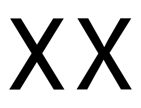
Crossing diagonals
When a bar crosses another diagonal or a straight line, it will need adjustments to not appear as misaligned.
In the example above, the X on the left has two unadjusted bars crossing each other. The example on the right has been adjusted so that they appear to be aligned.
As you can see in this X with dotted line on top of it, the X that appears visually aligned involves an offset.
Glyphs in which this illusion is relevant include x, X, k, K, ×, #, and the icelandic letter ‘eth’.
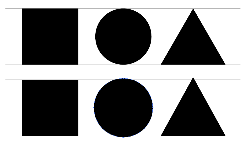
Perceived height
The shape of a glyph will contribute to how high it needs to be in order to look as if it is the same height as the other glyphs. Round glyphs need to overshoot the height of flat glyphs by a little bit. Glyphs which have pointier shapes will need to overshoot more. The sharper the shape, the more it will need to overshoot in order to look correct.
In the image above, the top three shapes are unadjusted — that is, they have identical heights. The three shapes on the bottom have been adjusted so that they appear more similar in height.
This illusion is relevant for any glyph that has parts which are either round or pointy. These include O, Q, C, S, A, V, W, and so on.
Because you can see both the illusion and the effect of correcting for the illusion, you will be able to make these corrections for yourself. You just have to trust your impressions.
Test for fitness of purpose
Just like you are able to see optical illusions and correct them, you also have the ability to tell if a font is working for the specific use (or uses) you may have in mind. That’s where you should also trust your judgment.
Quite separately, it is worth noting that no font can be evaluated apart from the way it is used and what it is used for. This is why it is essential to begin testing from the very beginning of the design process, and to continue testing until you feel the project is done.
What will these tests be like? The tests will be simple at first, allowing you to test the first design choices. As your design becomes more complete, your tests will need to keep pace and let you evaluate the relative success or failure of the newest choices you have made — or, even better, to compare two (or three, or more…) options you are considering.
Sometimes you will find you have to double back and change a design choice you thought was already working well. This is normal. Making a font requires balancing many variables, and surprises often occur. The more you design fonts, the more experience you will have in making these arbitrary choices.
When nearing the end of the process, if the font is to be used in a simple way, the tests should also just stay simple. However, if a font is to be used in many ways or in a wide range of printing or screen environments, then it should be tested across all that range of situations, which includes printing various samples of the font.
It can save you design time to have a well defined idea of the final use you intend. However, this is not always possible and your ideas may evolve. The key thing is to think about and define the use cases as completely as you can, then to ensure that your tests keep pace with the questions you are asking yourself while designing the font.
Knowing how to use illustrator means you know how to use pen tool i personally think its the main tool and i use it as often as possible for this step of the process i am going to be using the pen tool on illustrator to trace my sketches to they become vectors.
By using the pen tool, i can create polished lettering pieces which means crisp edges, sharp corners, and uniform thicks and thins. It means parallel lines, regulated sizes. Working with the pen tool can create a variety of effects but perfection (me being a perfectionist) is much higher when using this technique.
Noticed how ive used the pen tool to trace the initial drawing. the when the drawing is removed ill refine the letter to look like this.
the letter is then split up into sections and the extra interactive parts are taken off to create the standard letter which will be made in fontographer.
Fully traced Typeface NOTE: the letters with accents aren’t traced just copied over and tweaked using the software.
Offset lithography is the standard printing method used to produce paper based publications and documents; including many examples provided below from the book (Typography – Ambrose/Harris) However, other printing techniques exist for getting ink – and the design onto substrate.
Each of the techniques above imparts qualities into a design that are far beyond simply putting ink onto a page. Differences in the pressure used to apply the ink for example, can add individually, uniqueness or tactically to a design. These examples of letter press printing demonstrate how unique impressions can be created due to variations in the ink transfer from letters to substrate.
hot metal printing
hot metal printing or cast metal composition was developed from letterpress printing and originally involved the casting of lines of type on molten metal. This made it possible to create large quantities of type in a relatively inexpensive fashion. \Nowadays text is typed into a machine to produce a punch sort of paper tape, which then controls the characters cast by a machine. The resulting block – with its raised letters and fine detail can then be used to print from. The impression made, unlike lithography has texture and depth.
Silk Screen Printing.
Silk screen printing finishing forces ink through a stencil, pattern or template that has been produced on silk and stretched across a frame. The primary advantage of this printing method is that it can be used across a wide range of substrates, particularly those that are unsuited to other printed methods.
Gravure Printing.
Gravure or rotogravure printing is high volume intaglio print process in which the printing are is etched into the printing plate ink is then transferred from the plate to the substrate.
Print finishing.
A variety of print finishing techniques can be used to enhance the appearance of typography .. For example, the prominence of type can be increased with the use of screen printing or coloured varnishes. Similarly the use of blind embossing, flocking or spot varnish will render typography in a more subtle light. Basically, having an understanding of print finishing can make a difference between an ordinary and an exceptional piece of work. The execution of a final design is not only enhanced by bring finishing techniques, but it is inseparable from the process.
Embossing a debossing
Both of these techniques are used to produce different visual and tactile qualities to a design. particularly to the covers of reports, books, invitations, or other identity items.
Foil Blocking
Foil blocking is a finishing technique that applies coloured foil to a substrate via heat transfer (I have used this technique before when designing the brochure for Uniplay, it entails creating another file to overlay onto of your original design of which part you want to foil block) its typically used to provide a metallic look to the selected area.
Varnishes.
Varnish is a liquid shellac or plastic coating added to a printed piece after the final ink pass in order to enhance its appearance, texture or durability by sealing the surface. It may add a glossy, satin or dull finish and it can also be tinted to add colour. Varnish can be applied either as a spot varnish or a fully covering piece.
Working to a time frame improves my ability to focus. And with increased focus comes enhanced efficiency, because I don’t lose momentum. When I feel pressed for time and have to make a decision, I’m more likely to jump to conclusions without fully considering every option. This leads to poor decision making. Through effective time management, I can eliminate the pressure that comes from feeling like I don’t have enough time. I start to feel more calm and in control. When the time comes to examine options and make a decisions, instead of rushing through the process I can take time to carefully consider each option. And when I’m able to do that, I diminish my chances of making bad decisions.
I feel time management is the key to success, It allows me to take control rather than following the flow of others. As I accomplish more each day, make more decisions, and feel more in control, people notice. Managers will come to me when they need to get things done and that increased exposure helps put me in line for advancement opportunities.
DATE
ACTION
COMPLETION DATE
–/–/–
Research & Brief
03/03/19
04/03/19
Final finished Printing & Presentation Proposal (5thMarch 2019)
05/03/19
6/03/19
Week 1 Drawing Grid for letterforms. Organising what specific characters I will be drawing (Parameters)
10/03/19
11/03/19
Week 2 Sketching initial Concepts of letterforms
17/03/19
18/03/19
Week 3 Refining and detail Sketches.
24/03/19
25/03/19
Week 4 Testing of Individual letterforms (hamburgefont)
31/03/19
01/04/19
Week 5 Adobe illustrator tracing & Refinement
07/04/19
08/04/19
Week 6 Adobe illustrator Detailing
14/04/19
15/04/19
Week 7 Fontographer (learning)
21/04/19
22/04/19
Week 8 Fontographer Letter actions (spacing, kerning etc) and testing
28/04/19
29/04/19
Week 9 Final production of eps. Add ons
02/05/19
03/04/19
Further extended research and workshop Amsterdam
05/0519
06/05/19
Week 10 TEST TEST TEST AND BUILD FOR SHOW!
12/05/19
08/05/19
Week 11 Report!!!
14/05/19
14/05/19
Exhibition Visuals (Mock Up of exhibition to scale)
Note; this has been completed a little early which gives me time time to write my report earlier
Most typefaces can be classified into one of four basic groups: those with serifs, those without serifs, scripts and decorative styles. But now, typographers and designers have devised various systems to more definitively categorise typefaces, some of these systems have sub-categories. While four categories are clearly inadequate for design professionals, dozens become self-defeating.
Humanist
The Humanist classification has a varying stroke thickness deriving from the broad-edge oblique pen used for calligraphy. Humanistic typefaces also closely match the design characteristics and proportions of serif types, often with a strong calligraphic influence.
Examples include;
Schneider
Verona
Centaur
Kennerley
Old Style
The Old Face typeface have a broad pen like strokes giving a greater contrast in stroke weight than the Humanist typefaces. This classification is also known as Old Face.
Examples include;
Bembo
Calson
Dante
Garamond
Palentino
Script
Script typefaces are based on calligraphic forms. Many characters have strokes that join them to other letters.
Examples include;
Palace Script
Kuenstler
Mistral
Transitional
Typefaces classified in this group have a nearly vertical axis and high stroke contrast.
Examples include;
Baskerville
Bulmer
Century
Modern
Modern typefaces (Also known as Didone) have strong thick thin contrast, vertical stress, fine serifs.
Examples include;
Bell
Bodoni
Walbaum
Slab Serif
This category of typeface is easy to distinguish it has even stroke weights and heavy serifs.
Examples include;
Clarendon
Memphis
Rockwell
Sans Serif
This Typeface (also known as Gothic) have (almost) even stroke weights and are without serifs
Examples Include;
Gill Sans
Frutiger
Futura
Helvetica
Decorative
This is the largest category and also the most diverse. Rarely used for lengthy blocks of text, decorative typefaces are popular for signage, headlines and similar situations were a strong typographic statement is desired. They frequently reflect an aspect of culture such as tattoos or graffiti or evoke a particular state of mind, time period or theme. Some decorative typefaces use unorthodox letter shapes and proportions to achieve distinctive and dramatic results. Some even appear three-dimensional.
Type Styles
Different type styles are originally used to place emphasis on particular words, phrases and titles etc giving flexibility and enabling a hierarchy to be distinguished. Below i have listed variations of each term so that they cannot be confused.
Italic – Oblique
Extended – Expanded
Semi-Bold – Demi-Bold
Condensed – Compact – Compressed
Bold – Medium
Book – (This term is used when letterforms are slightly lighter than roman)